by Chris | Oct 11, 2019 | Case Study
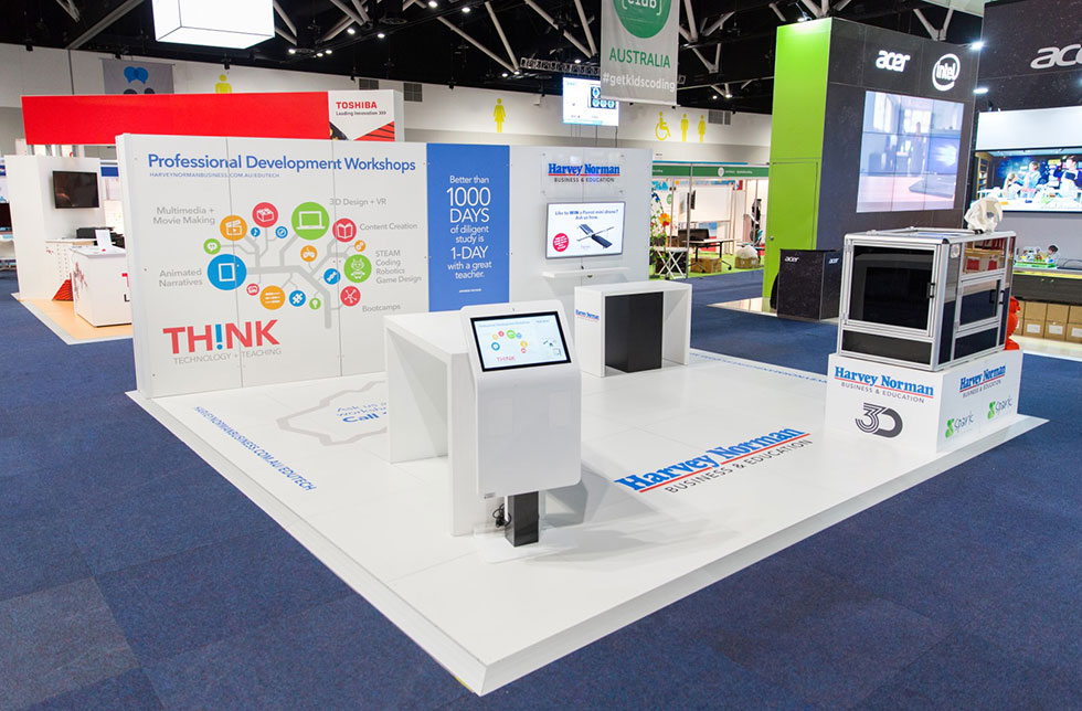
This kiosk was created for teachers at an education exhibition. Designed to make them aware of the full range of services offered by the business. As a hook to encourage interaction, there were two alternative prizes that visitors that entered for could be eligible to...

by Chris | Oct 11, 2019 | Case Study
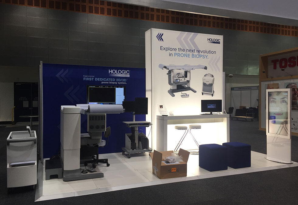
This touch screen was designed as a product presentation with a hierarchy of products allowing visitors to quickly navigate to what they were interested in. There was a combination of video and product brochures to obtain more information.

by Chris | Oct 11, 2019 | Case Study
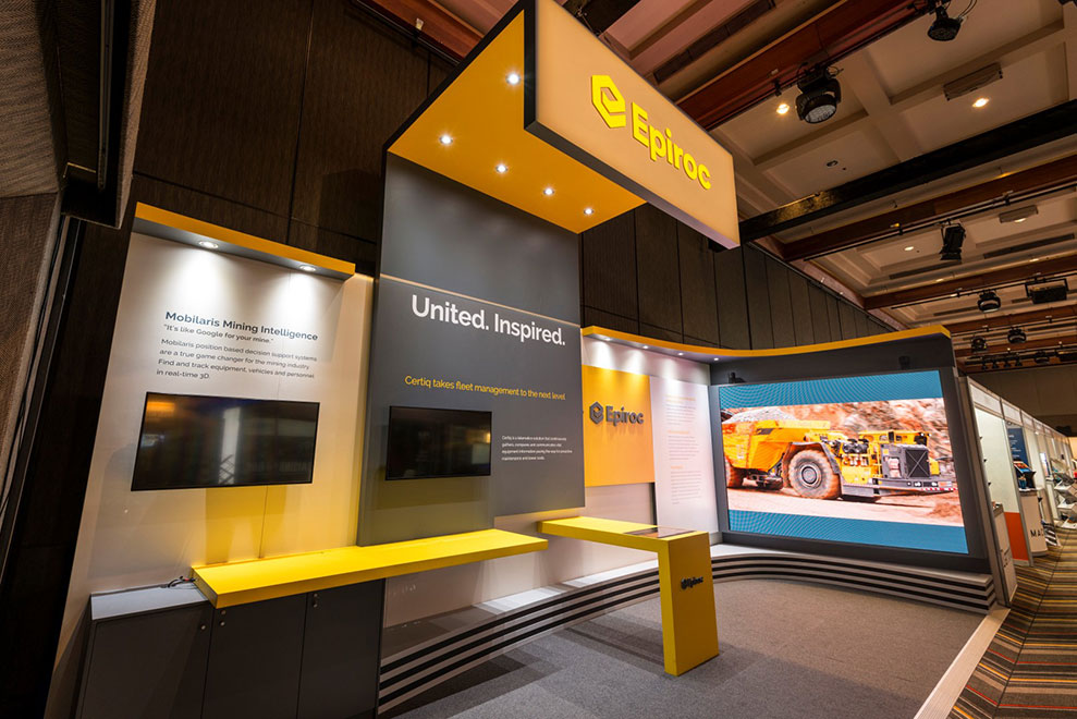
For this client we created a touch solution that complimented their sales discussions. Videos could be selected from a menu on the touch screen and played on a large format LED video wall. This allowed a larger group of people to view the video and piqued the interest...

by Chris | Oct 11, 2019 | Case Study
This touch screen presentation was designed for “e-brochure” distribution, allowing visitors to send themselves brochures they were interested in and enabling the company to follow up the resulting leads, knowing exactly what they are interested in. ...

by Chris | Oct 11, 2019 | Case Study
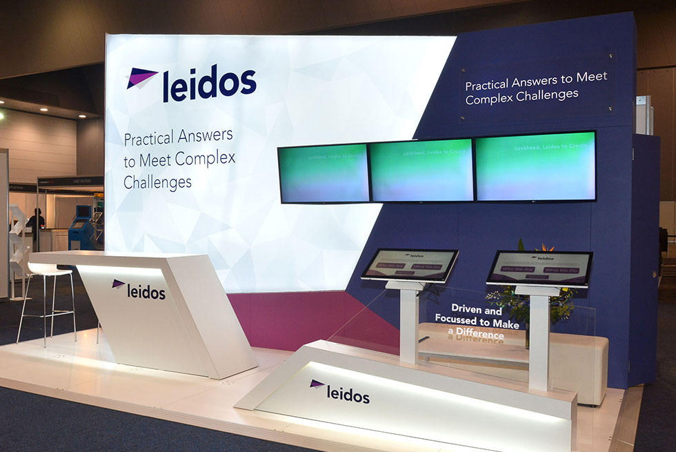
This company wanted to use touch screens as part of a rebranding exercise. Having merged with an existing company the touch presentation was to provide background on the company’s expertise and capabilities in an exhibition environment. It helped preoccupy...

by Chris | Oct 11, 2019 | Case Study
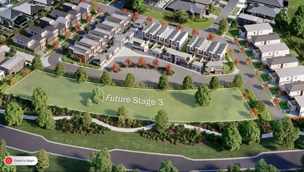
This touch screen presentation was created as a real estate selling tool. Purchasers are able to navigate through a available properties on a map and view floorplans and renders of display suites showing furnished rooms as well as the fittings and colour schemes....
